

Look at the screen below and reflect on your motivation levels to read and comprehend the information
NOTE: Please don’t tune out just yet, there is purpose behind this task! Once you make it past the screenshot, we will get into the good stuff!
How do you feel when you look at the screen?
A) I am super motivated.
B) ‘Yawn’, next.
How did you feel?
Most people would have experienced negative feelings towards this screen, which represents an overload of dense text.
Have you ever looked at a wordy document and felt your eyes glaze over as you decided to avoid the less than simple challenge of comprehending all of the information?
Imagine you are told that you need to learn about the code of conduct at your organisation.
How would you rather learn it?
A) A 20-page document with all of the information.
B) A 1-page document with the key points.
For many of us, the 1-page document would be the more favourable option (if it means we can still learn what we need to, of course).
The visual clarity of information affects the perceptual aspect of processing fluency, which impacts how easy it is to comprehend it (Malamed, 2010). It is therefore important to take this into consideration when we are designing eLearning.
There is interesting research out there that has enabled us as instructional designers to better understand these effects and design with our learner’s experience front of mind. Research has shown that when people have positive feelings towards content, it is easier for them to perceive and process it as their motivation to comprehend it increases (Malamed, 2010).
Here are some learnings that we have had at Belvista Studios that can support you in creating eLearning that reflects the notion that ‘less is more’, providing your learner with a great user experience. We have included some visual examples to make the tips as practical as possible.
1. Break Content Up
When we receive content for an eLearning module it is common to receive very large blocks of information. Rather than putting all of this information onto one screen, we make sure to break it up into chunks, preferably three. This allows the learner to learn small parts at a time and not become overwhelmed by a screen of dense text.
We want to make the experience as simple as possible for the learner as this will increase their knowledge retention and motivation to complete the learning.
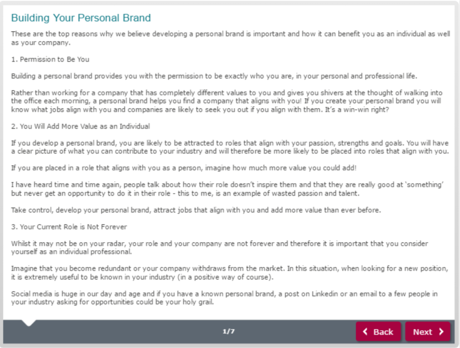
Remember the screen that you viewed at the beginning of the blog? Let’s look at how we could make this screen less overwhelming and break up the content into small chunks.
A) Here is the original screen with dense text
B) This is the same content broken into chunks
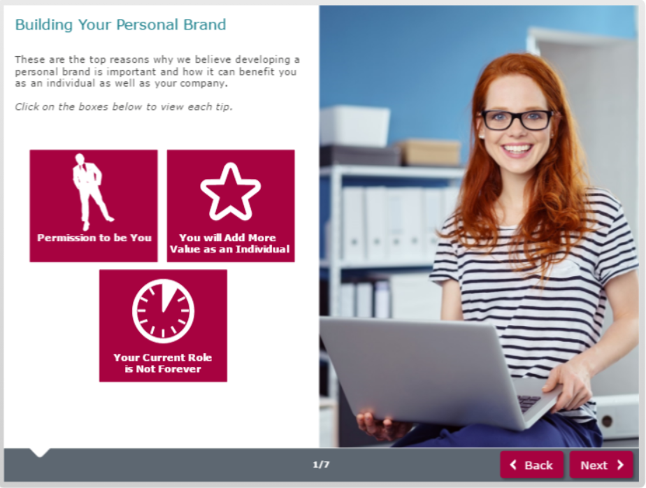
Each tip is put onto a button on the screen.
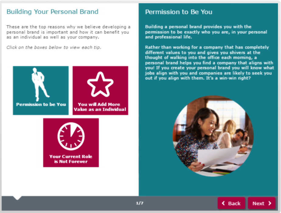
When the user clicks the relevant button, information for the tip appears on the side of the screen.
The learner still receives all of the information that they need to achieve the learning outcomes, however, it is designed in a way that makes it look more simple and easy to comprehend.
2. Is all of the Content Necessary?
When deciding what content to include in your eLearning module, it is important to consider what is actually required to achieve the learning outcomes.
It is easy to think that your learners need to read and understand a long list of items and information to achieve the learning outcomes. As humans, our brain can only retain a certain amount of information, so it is unrealistic to expect your learner to learn and retain an extensive list. Research has shown that our short-term memory only holds a small amount of information (seven items or even less), so it is important to keep this in mind when you are designing your learning (Mastin, 2018).
If your content is dense, refer to the intent of the course and the learning outcomes to enable you to potentially cut out unnecessary information. It’s desirable that your learner retains the important points of your learning rather than risking them becoming overwhelmed with too much information and instead end up retaining nothing.
3. Keep Instruction Text Short and Sweet
Something that I have been learning as an instructional designer is how to keep instruction text short and sweet. It can be easy to use three sentences to explain something that could be said in one. It reminds me of university when you had to reach a word limit and ended up explaining a simple concept (that could be explained in one sentence) using a full paragraph so you could reach 1000 words. There is generally no word-limit for your eLearning course (not that I have come across anyway?!), so your challenge is to do the opposite and explain it in the most simple and short way possible.
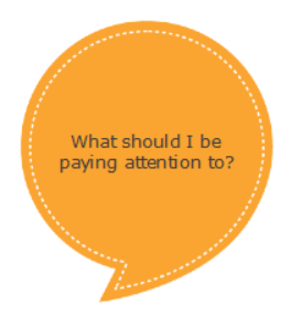
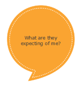
Put yourself in the shoes of your end user. When they visit a screen, they are likely to have the following thought process:
The last thing you want to do is to make their life more complicated by having them read unnecessary text or confuse them.
Here are some actual examples of instruction text that we have improved with the intent of making it as clear and concise as possible.
Before
|
After
|
Click on the boxes to learn more about each of the considerations. The next button will be disabled until you have visited all of the considerations.
|
Click each box to learn about the considerations and enable the next button.
|
There is a great app that you can use to make your writing bold and clear. It highlights lengthy and complex sentences and provides you with tips for improvement. It is called the Hemingway App and you can access it by clicking here. This app is a great help to us at Belvista Studios, so I hope it adds value to you!
4. Show Concepts Visually
Another way to break up dense text is by displaying the concept visually through images. People will avoid reading large chunks of text and are more inclined to look for simpler ways of comprehending the information. Where possible use visuals such as photographs and graphics to convey the information.
I have included a practical example on how you can achieve this below.
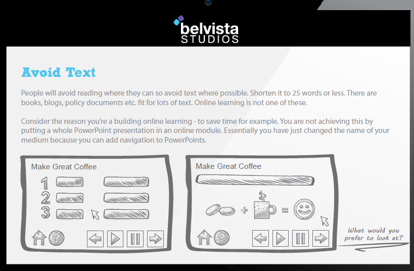
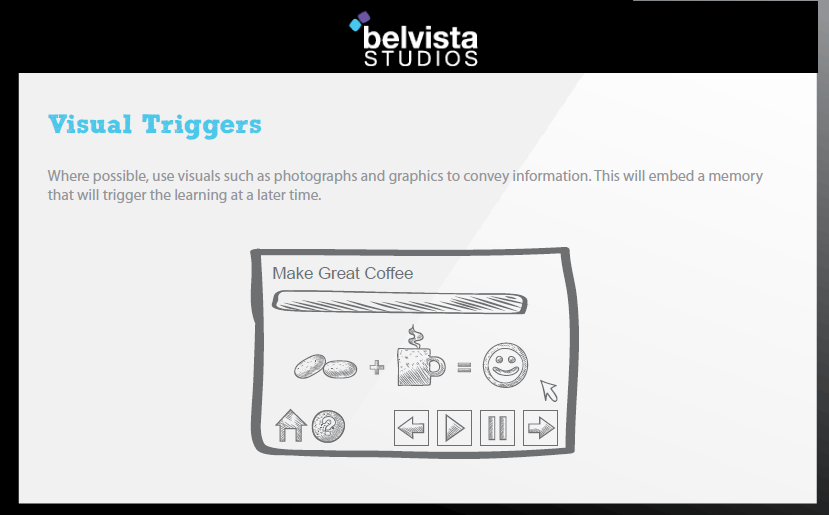
An example of a concept shown visually through icons rather than dense text.
Those are our top tips for keeping your learning content short and sweet. How do you design your eLearning to ensure that your end user can easily understand it? We would love to hear how you keep your learning simple and comprehendible. I hope this blog added value to you and remember less is more!
References
Malamed. C. (2010). How Visual Clarity Affects Learning. Retrieved from http://theelearningcoach.com/learning/visual-clarity-and-learning/
Mastin. L. (2018). Short-Term (Working) Memory. Retrieved from http://www.human-memory.net/types_short.html 


0 Comments
We'd love to hear from you. Send us a message and connect!
Emoji