

“Get rid of half the words on each page, then get rid of half of what’s left.”
- Steve Krug
Studies show that the usability of eLearning is crucial to its success as a learning solution (Mo2L, 2009). Imagine you are completing an eLearning module with buttons that don’t work, activities with no instructions and information that is overlapping on the screen. Would you feel inspired and enthusiastic about completing the module? This can lead to a frustrating experience that results in learners spending all of their time figuring out the navigation rather than actually learning the content. You want your learners to be able to give their full attention to the learning. The navigation and mechanics behind the module should all happen with minimal thinking required.
A prime example of usability in play can be described through a phone application that I recently downloaded. I wanted an application that would enable me to lay text over images. The application that I downloaded looked great and the example pictures were impressive. Unfortunately, the moment I opened the application, I had no idea how to navigate it. I couldn’t even find the option to upload an image (which was step one). After a while I lost interest and deleted the application. All of my energy was focused on how to navigate it rather than fulfilling the intent of it (creating awesome text images). Whilst it may have produced amazing images, the difficulty involved with usability resulted in a negative experience and eventually deletion of the application.
How do you ensure that your learning solution provides your learner with an effective user experience? There are many ways that you can achieve this. Check out some tips below.
Visibility of Module Status
When your learner is immersed in a learning experience, it is important that they know what their status is within the learning. Do they need to type something into a box? Do they need to listen to an audio track? This can be achieved by providing them with appropriate instructions and feedback throughout different stages of the module. There is nothing worse than a learner looking at an ambiguous screen and not knowing what to do next or how far they have progressed. Keep them up-to-date and informed e.g. “Click on the red button to listen to an audio track on this topic” or “Watch the video and reflect on how you would handle this situation”. This provides the learner with direction rather than just putting a audio file or a video on the screen with no explanation.

Example of instruction text/direction in a module.
Consistency
Another way to ensure a good user experience is by keeping the design of the learning module consistent. This includes keeping the same fonts throughout and formatting instructions the same way. For example, to ensure your instruction text is consistent throughout a module, you could make all instruction text in ‘italics’. The learner will begin to pick up on the pattern and in no time their brain will detect instruction text before they have even begun to read the sentence. This frees up your learner’s brain space for more important things like learning the content! Another way to ensure consistency is to keep the design of the module layout consistent throughout the whole eLearning course. For example, don’t move the navigation from the top of the module on one screen to the bottom of the module on the next. This may confuse your learner and result in them spending unnecessary time on figuring out the navigation of the module.
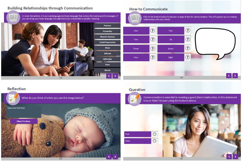
Example of consistent design across module screens.
Minimalist Design
The last thing you want for your learner is for them to experience ‘Cognitive Overload’. This is where they become overwhelmed with the amount of content on the screen. Keep your design as simple as possible and avoid including any unnecessary information. For example if you have a screen with a significant amount of text, a video, multiple resource links and multiple images, you could imagine that this could become overwhelming for the learner. Instead, separate these components over multiple slides or rethink whether all of that content is actually required to achieve the learning objectives (can it be structured in a simpler way?). “Dialogues should not contain information which is irrelevant or rarely needed.” (Hetsevich, 2014).
The last thing you want for your learner is for them to experience ‘Cognitive Overload’. This is where they become overwhelmed with the amount of content on the screen. Keep your design as simple as possible and avoid including any unnecessary information. For example if you have a screen with a significant amount of text, a video, multiple resource links and multiple images, you could imagine that this could become overwhelming for the learner. Instead, separate these components over multiple slides or rethink whether all of that content is actually required to achieve the learning objectives (can it be structured in a simpler way?). “Dialogues should not contain information which is irrelevant or rarely needed.” (Hetsevich, 2014).

Example of minimalist and cognitive overload design in a module.
Placement of Content
An eye track study by ‘The Nielsen Norman’ group revealed that we prefer to read content in an ‘F’ shape; two stripes across and one stripe down (Bland, 2016). This tells us that users generally don’t read all of the information on a page thoroughly and that we need to put the most important information in the correct position to avoid it being missed. Overall, place important information at the top of the page, keep information concise (Bland, 2016) and separate the information into digestible chunks.
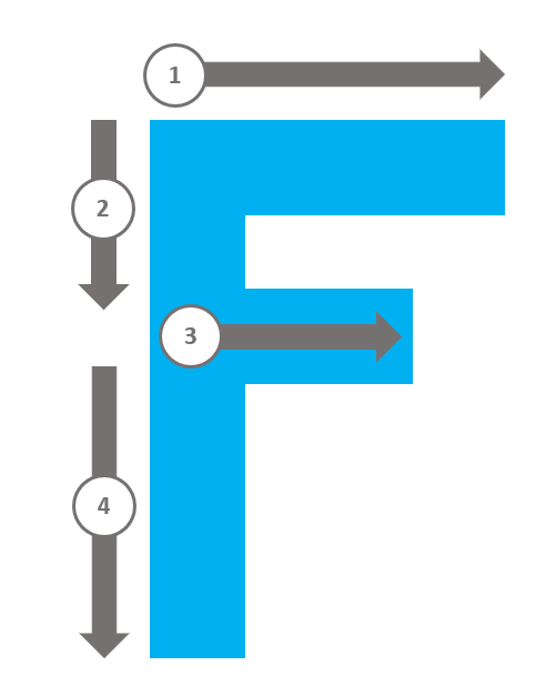
Diagram portraying the ‘F’ shape eye tracking.
An eye track study by ‘The Nielsen Norman’ group revealed that we prefer to read content in an ‘F’ shape; two stripes across and one stripe down (Bland, 2016). This tells us that users generally don’t read all of the information on a page thoroughly and that we need to put the most important information in the correct position to avoid it being missed. Overall, place important information at the top of the page, keep information concise (Bland, 2016) and separate the information into digestible chunks.
Diagram portraying the ‘F’ shape eye tracking.
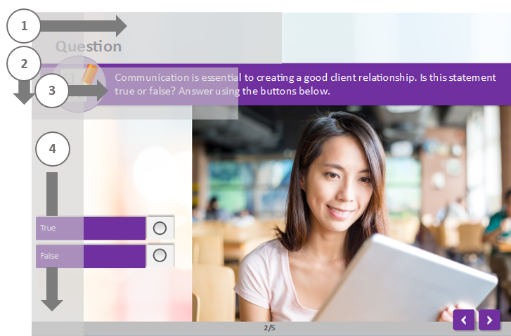
F diagram eye tracking example on module screen.
Feedback from User
Lastly, the best way to improve your learner’s user experience is by asking! Ask your learners to describe their user experience to get a good idea of what is required to improve it. Did they have any difficulty finding anything? Could they digest all of the information? What would make it easier for them? These are all questions that are crucial in creating an optimal user experience. Another great way to test the usability of a learning experience is to observe the learner in action as they complete the learning activity. You may notice that they struggle with certain actions or navigation or pause and take some time to comprehend certain instructions. This way you are able to gain a realistic representation of the learner’s usability experience.
We would love to hear how you strive to improve user experience in your learning solutions. What tips and tricks do you have? We hope you enjoyed this blog on improving usability in eLearning and we look forward to sharing more tips with you into the future!
A little bit about the author...
"I am Hannah and I am passionate about how we can create effective and fun learning experiences. I believe that if you create enjoyment and social connection through learning, learning outcomes can sky rocket! The world is changing and becoming more and more digital by the day. We need to harness this and see what's possible!".
"I am Hannah and I am passionate about how we can create effective and fun learning experiences. I believe that if you create enjoyment and social connection through learning, learning outcomes can sky rocket! The world is changing and becoming more and more digital by the day. We need to harness this and see what's possible!".
References
Bland, F. 8 Tips to Create the Best User Experience in Your eLearning Course. Retrieved from https://elearningindustry.com/8-tips-best-user-experience-elearning.
Hetsevch, I. (2014). How to Improve eLearning Course Design Usability by Adopting the 10 Usability Heuristics. Retrieved from https://elearningindustry.com/how-to-improve-elearning-course-design-usability-by-adopting-the-10-usability-heuristics.
Krug, S. (2014). Don’t Make Me Think: A Common-Sense Approach to Web Usability. United States. New Riders Press.
M02L (2009). eLearning Usability. Retrieved from http://www.elearning-usability.com/publications.html.


0 Comments
We'd love to hear from you. Send us a message and connect!
Emoji